Brewing Identity: The Amira Coffee Logo Story
LOGO DESIGN AND BRAND IDENTITY

Initial Design
It started at 3 AM in a tiny off-campus apartment kitchen. Just me, a sketchbook, and endless cups of coffee (oh, the irony). Creating Amira Coffee's logo wasn't just about design – it was about capturing culture, legacy, and that luxury coffee experience I knew we could bring to the East Coast.
My background in calligraphy (fun fact: that same passion sparked my first viral TikTok moment – but that's a story for another post 👀) proved to be useful during the design process. Those late-night sketches evolved into something special: a logo where English meets Arabic script.
From rough sketches to Canva drafts to final vector art in Adobe Illustrator, each iteration got us closer to what Amira Coffee is today: a brand that bridges cultures and elevates everyday coffee moments into something royal.
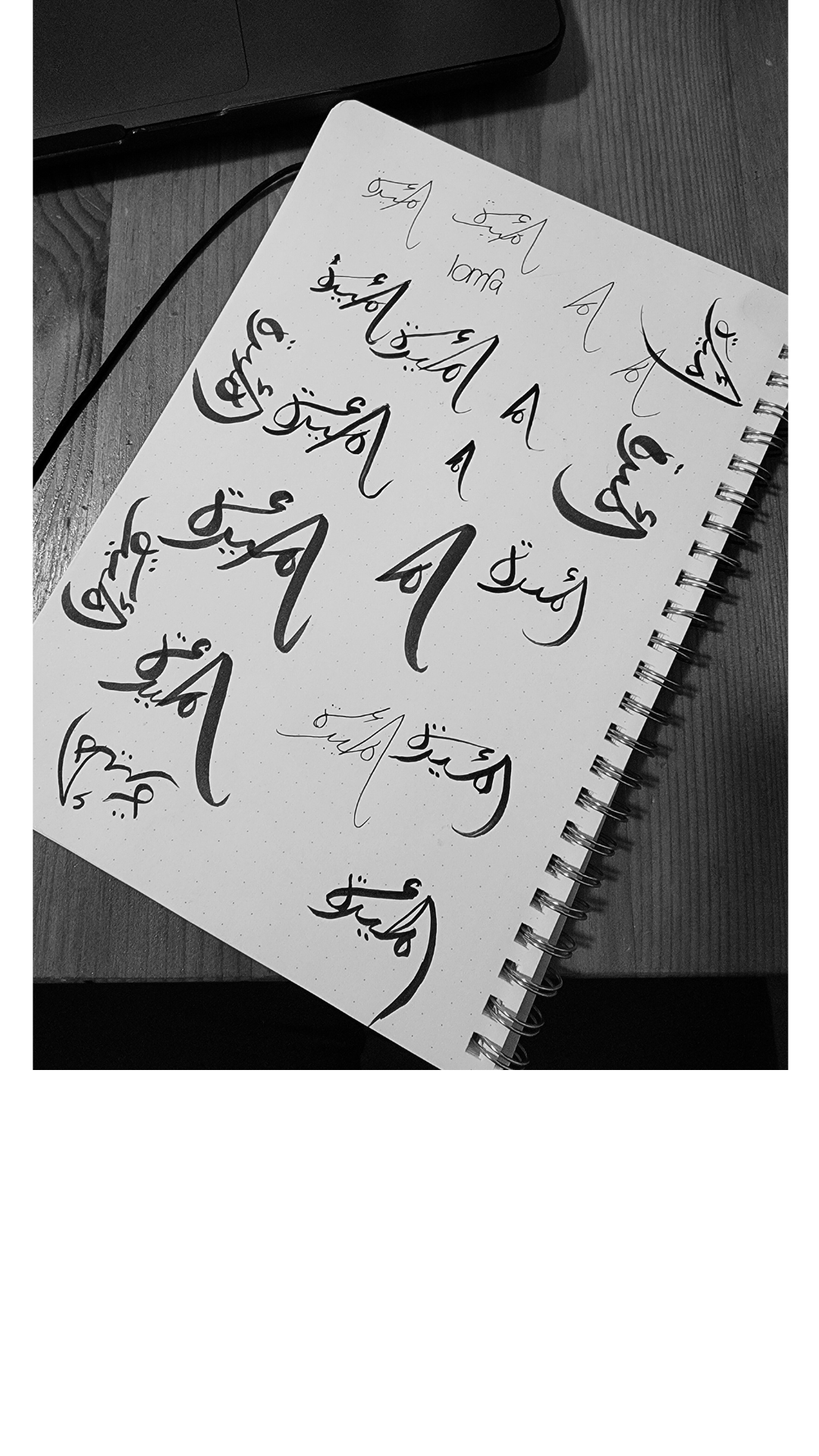
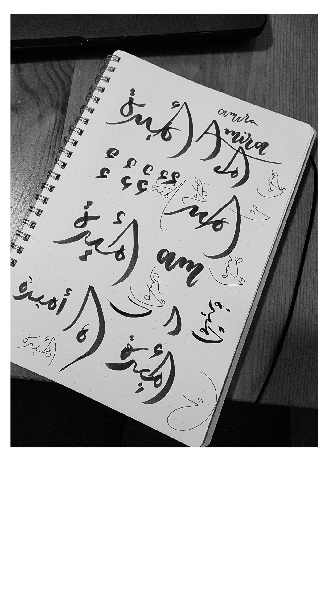
Initial Calligraphy Sketches
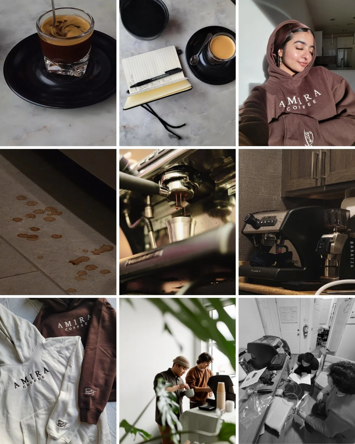
Photos from Early Stages of the Company
Meaning and Details
The name Amira, meaning "princess" in Arabic, was a perfect fit. It spoke to both the elevated coffee experience I envisioned and my Muslim heritage. Plus, it resonated with our target clientele who appreciate that blend of luxury and cultural authenticity.
Our logo itself embodies this fusion. The Arabic script flows naturally into Latin letters, creating a design that's both meaningful and visually striking. The 'A' doubles as an 'alif' (first letter of the Arabic alphabet), while the full design reveals 'Amira' in flowing Arabic script with a hidden Latin 'A'.
Looking back from our current success to those 3 AM kitchen table sessions, one thing's clear – sometimes the best brand stories start with a simple sketch and a big dream.

Hidden Latin ‘A’ which doubles as the ‘Alif’ in the Arabic Script
Logo Drafts
Branding Guide
The visual identity came together through intentional choices that reflect Amira's essence. Our color palette tells a story of sophistication and warmth: a soft cream (#FFFAF2), a gentle sage green (#C8D6C1), our signature olive tone (#8F8D74), a warm taupe (#9B8163), and a grounding black (#000000). Each color was chosen to create an atmosphere that feels both elevated and welcoming – much like the experience we wanted to create in our space.
The typography choices were equally intentional. We selected three distinct fonts that work in harmony: Amiri for its cultural authenticity, Burgues Script for those elegant touch points, and Montserrat Classic for its clean, contemporary feel. The combination strikes a perfect balance between heritage and modernity, luxury and accessibility.
These elements came together in our brand style guide, ensuring every touchpoint of Amira Coffee tells the same cohesive story – from our event signage to our website.
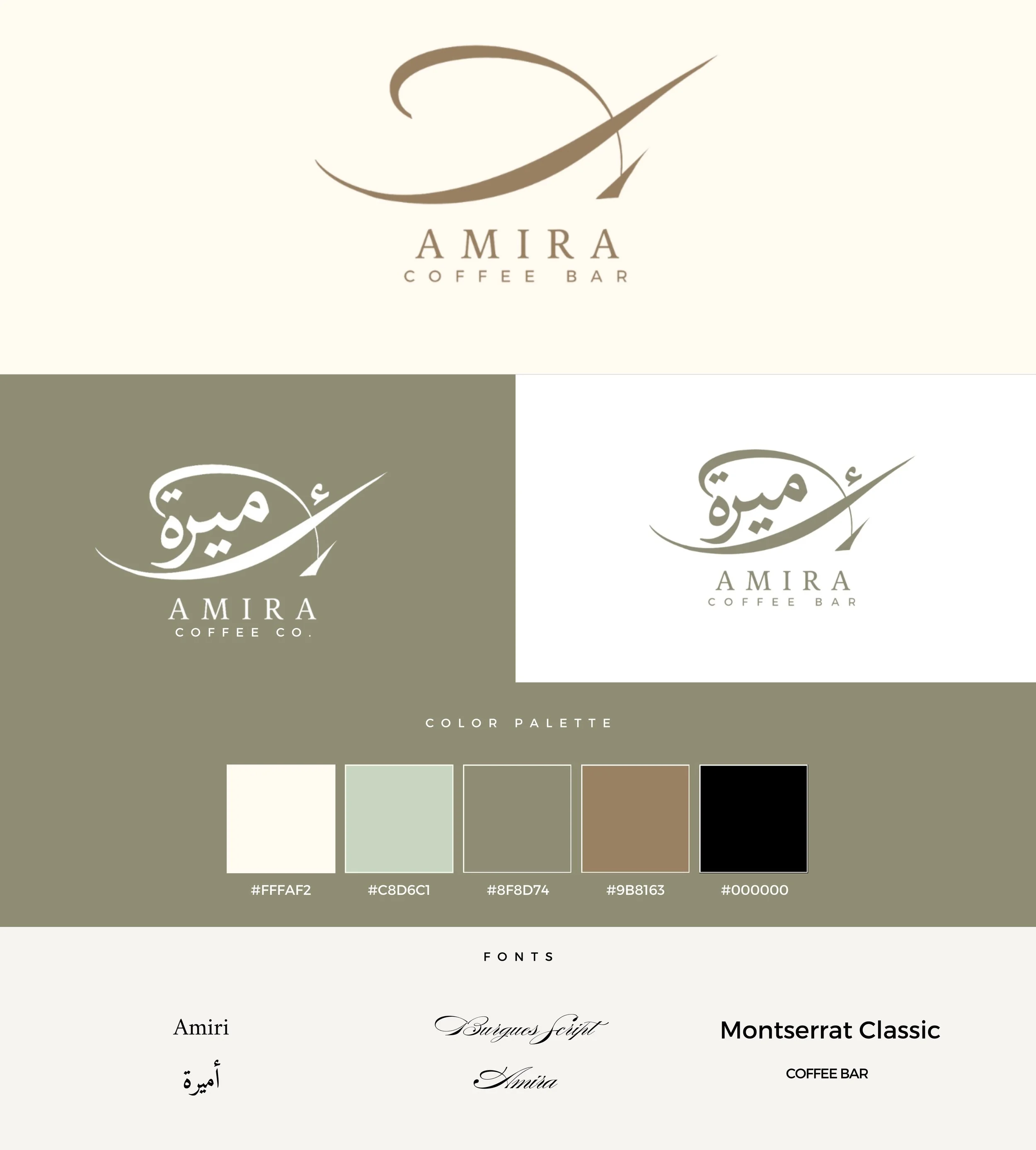
Brand Style Guide

Team Members Dressed in Brand Colors