Four Hours, One New Logo
Redesigning the MKP monogram myself, from sketchbook to Illustrator
LOGO DESIGN AND BRAND IDENTITY · OCTOBER 2026
The old M/K
My original logo was a script M/K I made back when the business was pretty much just me.
A lot has changed since then. We’ve grown into a team, the work has evolved, and these days most people just call us MKP. My friends have started calling me that too.
I wanted a monogram that felt like where we are now, without losing the elegance of that original script.
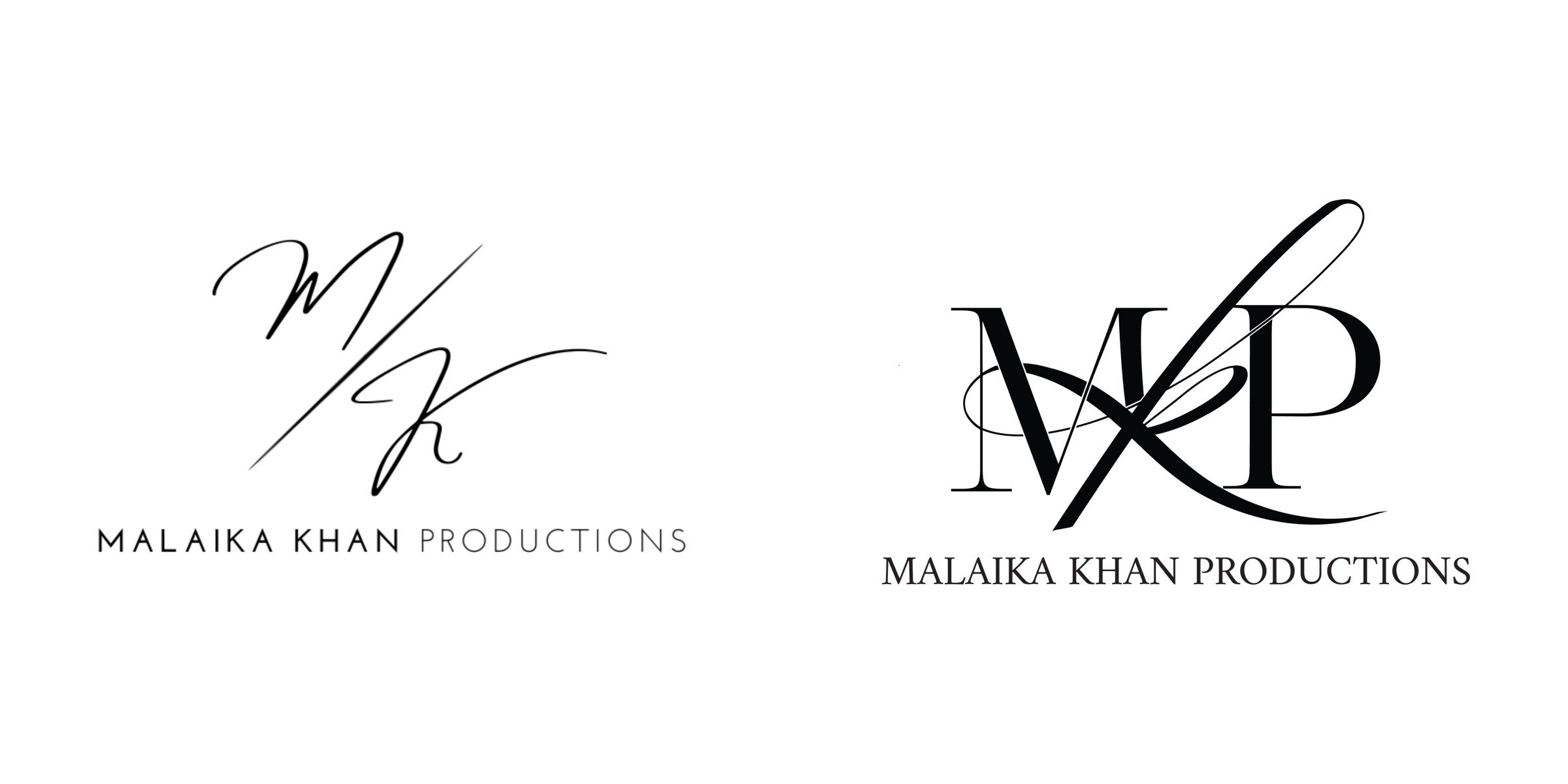
Before: M/K
After: MKP
Back in Illustrator
The last time I opened Illustrator, I was in high school and spent most of my free time drawing. I hadn’t really touched it since.
I’ve always liked picking up new skills, though. When MKP was a one-person team, figuring things out myself was basically the job description, and that habit stuck.
So instead of handing the logo off, I decided to teach myself Illustrator properly this time. It went about how you’d expect.
WHAT I POSTED THAT DAY
“First time using Illustrator to create a logo, and it’s safe to say that I’ve added a new skill to my set, along with a new thing to hate next to Meta Business Suite!!”
OCTOBER 22 · FOUR HOURS
From paper to pixels
i.
PAPER FIRST
This is where the art kid in me took over. Before opening Illustrator, I grabbed a brush pen and filled my sketchbook with MKP after MKP, trying every way the letters could cross and overlap.
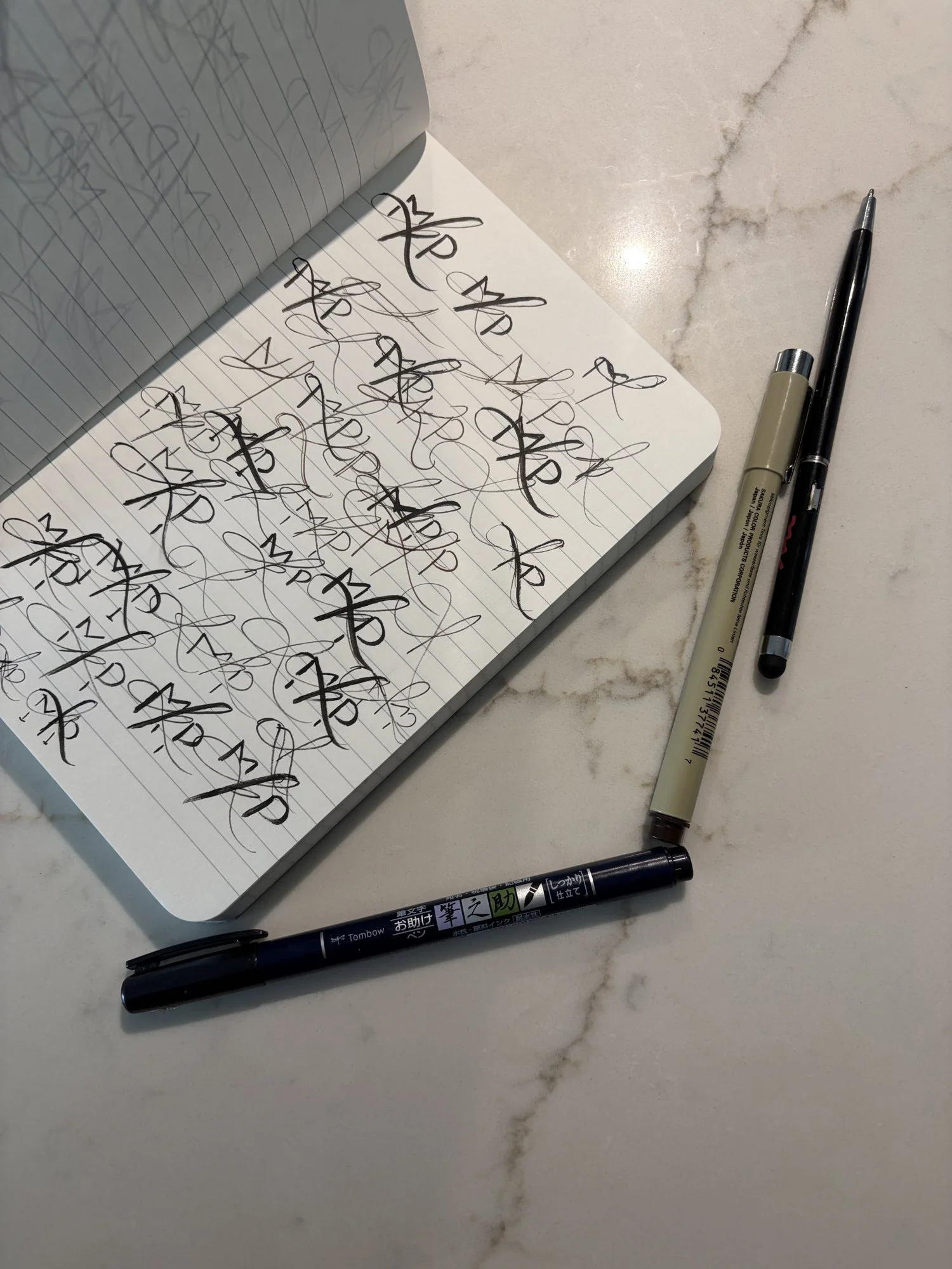
A lot of M’s, K’s and P’s before I found one I liked.
Still sketching.
ii.
ONTO THE SCREEN
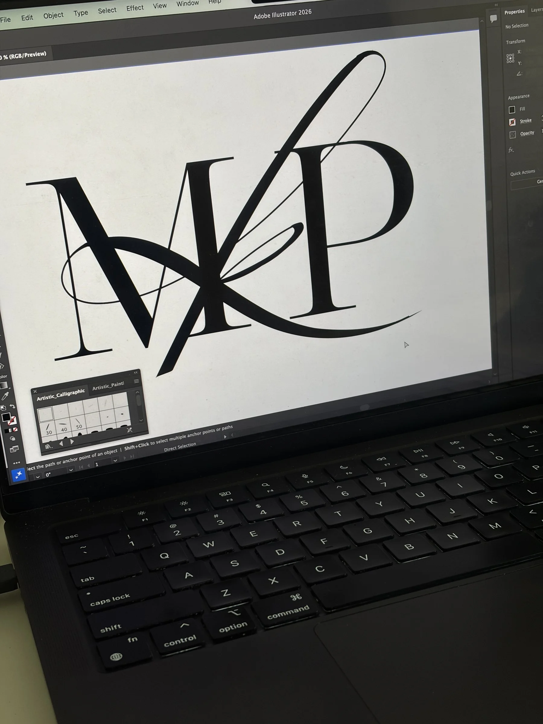
Then came the actual learning part. I scrolled through Adobe Fonts for a serif I liked, then figured out Illustrator’s calligraphy brushes so I could draw the K the way I’d been drawing it on paper.
Adding the calligraphy strokes.
Font shopping.
iii.
VERSIONS
Then I made versions, put them side by side, picked a favorite, and zoomed way in to clean up every spot where the lines cross. Turns out that’s what anchor points are for.
Narrowing it down.
Zoomed way in on the anchor points.
4 hrs
From first sketch to final logo.
THE NEW MKP MONOGRAM

Where it landed
A serif M and P, with the K drawn through the middle in one long brush stroke, a nod to the elegance of the old script M/K.
I genuinely love it.
What’s next
It’s already on the new Malaika Khan Productions website, and you’ll start seeing it on our galleries and wedding films.
And I can now say I know how to use Illustrator. Mostly.
If you want to see it in action, take a look at our wedding portfolio and films from New Jersey, New York and beyond. And if you’re into this kind of thing, I also wrote about designing the Amira Coffee logo.